
In the past few years, we’ve seen customer satisfaction with the Cisco Technical Support site experience steadily increase, yet we also hear customers and partners say that they don’t notice many differences in the site itself. Is that a happy coincidence? As users, are we just more likely to notice what’s broken, and not what’s improved? Bill Skeet, Manager, User-Centered Design for Cisco.com, has a better explanation. I’ve invited him to the blog to share his forward-thinking strategy for improving the support website, and to highlight some of the real differences that you may not have noticed.
 By Guest Author Bill Skeet
As we manage the Cisco Technical Support site, we make it a priority to make things easy so you don’t waste your time. That means we are constantly changing the site and launching improvements that will help you find what you’re looking for so you can complete tasks as quickly and easily as possible.
For instance, we’ve improved site search, added new sections and pages, streamlined tools, and tweaked link labels and terminology to be more understandable.
What? You didn’t notice?
Well, that’s not a surprise. We’re always talking to our customers and partners, and we know that many users have not noticed changes.
Here’s an example – at our annual Cisco Live! conference, we often recruit attendees to participate in usability tests. We hear numerous comments from these customers about aspects of the site that they had not noticed or seen before, even though that feature may have been released months previously. Our web logs, however, show that the changes have already been used and adopted by users.
It’s an interesting paradox that while change is constant in the world around us, most change goes unnoticed. Humans have evolved to notice changes that are important for survival, and to be blind to changes that are benign. In nature, there is no need to waste mental energy on things that aren’t potential threats… life’s too short.
We think that axiom applies in business as well.
Our philosophy is to make changes at a constant, steady pace that is almost imperceptible to our customers. We call this “invisible change.”
The principles of invisible change are complementary with popular development methods and practices, such as agile and continuous delivery. They accelerate results to customers through quick, iterative releases.
The goal is to avoid distracting, disrupting or disturbing our customers’ efforts to complete their objectives while using the site. We strive for a pace of change that is equal to the rate at which customers can absorb and digest the changes effortlessly. We rarely make announcements or ask you to “check out” some new design.
Since you have read this far, however, you might be interested to know about a few important improvements during the past year that you probably never noticed.
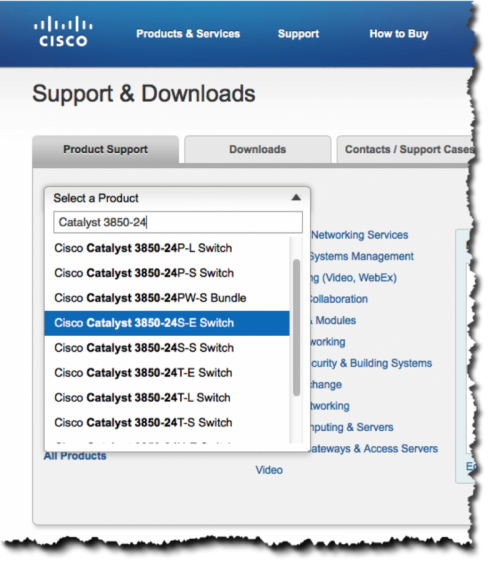
1: The product search box on the Support Home Page was replaced with a drop-down menu that offers choices as you type. It’s also available from anywhere on the site on the MegaMenu. Now it’s faster, easier and more reliable to find any product page.
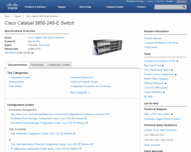
2: More than 7000 product model pages were added to the site. These pages consolidate product documentation, downloads and resources onto a single page for hardware, software and interfaces and modules.
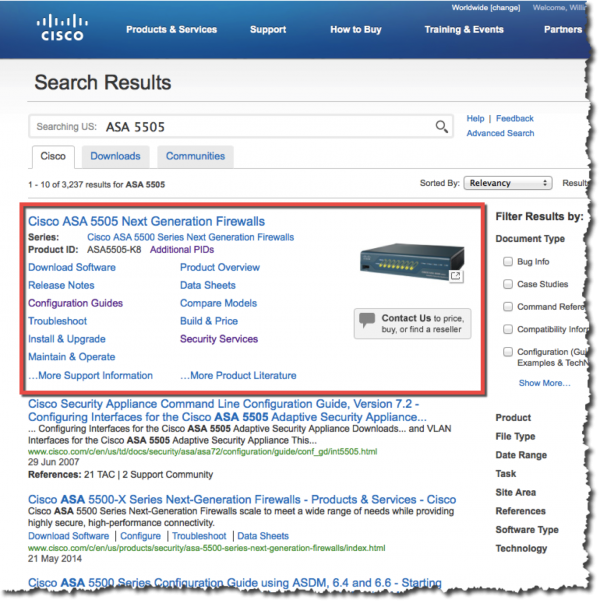
3: On the search results page, we added a special information box for our most popular products. This box aggregates the most popular links for a product in one place so the links are easier to find.
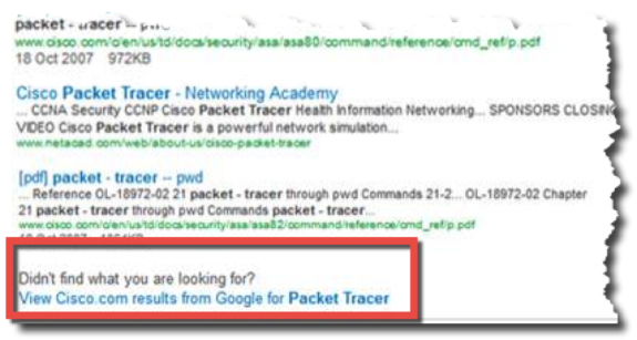
4: We made many other changes to Cisco.com‘s search, including tuning the relevancy of results and improving the look and feel of the search results page. However, in case the result you are looking for doesn’t present itself, we have integrated Google’s search service (shown below) as an alternative. This link, at the bottom of every search results page, returns the results from Google for the term you searched for on Cisco.com with one click.
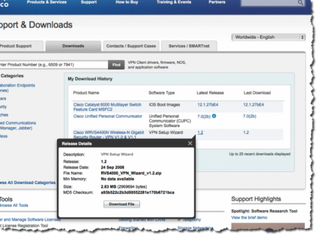
5: The Support Home Page has numerous shortcuts available for our logged-in customers, partners and registered users. For instance, we track recently viewed product pages and recent downloads for easy access directly from the home page. And if you are responsible for opening and tracking support cases, we also provide a quick view of your open cases from the home pages as well.
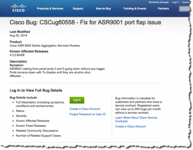
6: Our bug content is protected and requires users to log in to view the details. That means search engines can’t crawl those pages and make them searchable. We know many people use Google to find Cisco content, so we’ve created “preview pages” that provide a summary description of the bug. This information can be crawled by search engines and it makes our bug information more findable.
While the users of the site may not notice these changes, our research tells a bigger story. We measure progress with three different tools: a customer satisfaction survey, observational studies of customers using the site and website analytics.
The support site is currently receiving the highest scores for satisfaction ever. Site metrics indicate that information is being found and used. And our usability sessions reveal that some of our most important tasks are easier to complete.
Our pledge is to continuously improve your Support Site experience. If we are successful, customer and partners will feel more proficient and will accomplish tasks faster on the support website, even thought it may appear to be the same old, familiar website.


Now, the world in my hand, thanks for your article. Every company need BYOD… Thanks bro..