It’s springtime…typically the time of year when you need to purge your house of all the clutter that’s accumulated during the winter. At the same time, spring always reminds me to do some extra sprucing up around the Cisco digital house — and start checking it from top to bottom with renewed vigor.
So I took stock recently and was pleased to see all the heavy-duty spring cleaning improvements we’ve made of late. Here’s a sampling, plus some tips on how to approach your digital spring cleaning regime:
Leverage data and insights.
We took a recent look at the traffic patterns on our Cisco.com menus. The majority of visitors to the “Products and Services” menu were gravitating to a subset of items. So we took the opportunity to do some clean-up and make that menu more readable by eliminating items with low traffic.
For more details on this change, see our blog: “A Simple Update to Our Cisco.com Menus”.
Optimize for mobile environments.
We’ve observed that visitors to Cisco.com will readily click on links to product pages. They will also scroll to the bottom of a page to find key assets such as solution overviews and white papers.
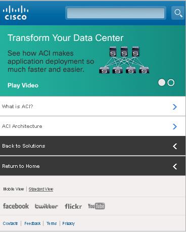
But the behavior patterns are different on our mobile site. Take, for example, our Application Centric Infrastructure (ACI) area. Most visitors weren’t going far enough down the menu on the landing page to get to the ACI Products. And almost nobody clicked through to the Resources page, which listed all the great overviews and white papers.
So we did some spring cleaning. We removed several pages entirely and linked to the products right from the first two primary mobile pages. We also improved the labeling, calling out the type of assets (White Papers and Overviews). The result: the click-thru rate (CTR) on the index page jumped from 59% to 74% and the bounce rate dropped 36%. Traffic patterns so far also indicate that users are getting to the product pages and collateral more quickly.

Give ‘em what they want — fast.
On our Midsize Business Solutions site, we noticed a fair number of people clicked on a “Find Solutions” menu option. But the label was somewhat misleading, as it took visitors to a set of pages that focused first on business challenges, then provided paths to specific solution pages. So we renamed that label “Business and IT Challenges.” (We also consolidated those pages for simplicity.)
Then we created a new page with an overview of network solutions for midsize businesses – what our users were really seeking. That page became the destination for “Find Solutions.”
We also cut down a lengthy Overview page by 35% to see if we can increase engagement and guide people deeper into the site, faster. It’s too early to tell how well it’s working, but it’s all a matter of giving people what they want faster — and clearing out all the digital clutter.
Innovate.
Once you’ve made headway on your digital spring cleaning, it’s time to add the key features your users want. One area we worked on was our video content and journey.
We know that Cisco.com visitors like videos and are often ready to take action while watching them — so we added some clickable calls to action (CTAs) within the videos. The results were immediate. For instance, one new CTA promoting a webinar within an ACI video quickly garnered nearly 300 registrations that we wouldn’t have attracted otherwise.

As with all things digital, you want to continually measure and refresh (and sometimes do a thorough deep-cleaning when you find areas that aren’t working optimally). Using some good old-fashioned elbow grease combined with a dose of innovation and experimentation will go a long way to getting your digital house in order.


Thanks for the reminder to look into what our clients are doing. So many online services track all the user interaction, where people click and how they navigate through the website, I just needed a reminder to actually look at that data!