
Part 3: Cisco Use Case and Designing Your Own Time Series Problem
This is a continuation of the Time Series Analysis Posts. Here, I will detail a Cisco use case utilizing time series analysis and ARIMA from part 1 and part 2 of the blog series. If you have not read those yet, feel free to do so. Let’s dive in to the use case!
XI. Cisco Use Case – Forecasting Memory Allocation on Devices
Background: Cisco devices have a resource limit (rlimit), based on their OS and platform type. When a device reaches its resource limit, it might indicate harm in the network or a leak. High water mark is used as a buffer to the resource limit. It is a threshold, that if it reaches the resource limit, indicates a problem in the network. For more information on high water mark, here is a useful presentation on what it means for routers and switches.
Problem: The client wants to track and forecast high water mark over a two-year period. We need to determine if/when high water mark will cross the resource limit two years into the future.
Solution: To solve this problem, we used time series forecasting. We forecasted high water mark over a two-year period.
A lot of effort went into thinking about the problem. I will put the general steps we took in solving this before going into the details. Notice that most of these steps were mentioned or highlighted in the first two blogs!
- First, we looked at and plotted data
- Second, we formulated hypotheses about the data and tested the hypotheses
- Third, we made data stationary if needed
- Fourth, we trained many separate model types and tested them against future values for validation
- Finally, we gave conclusions and recommendations moving forward
1) Looked at and Plotted Data
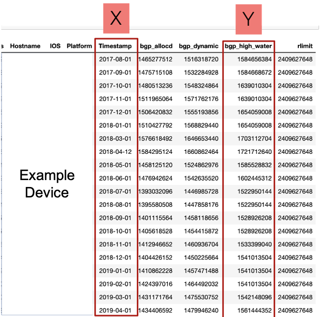
When we initially received the dataset, we received numerous variables in addition to high water memory utilization over time. We received 65 devices and for each device, we were given about 1.5 years of data in monthly snapshots. Below is information on one example Cisco device. Note the variables labeled X and Y (timestamp and “bgp_high_water”). These are the variables we are interested in using for our forecast. The “bgp_high_water” variable is represented in bytes.
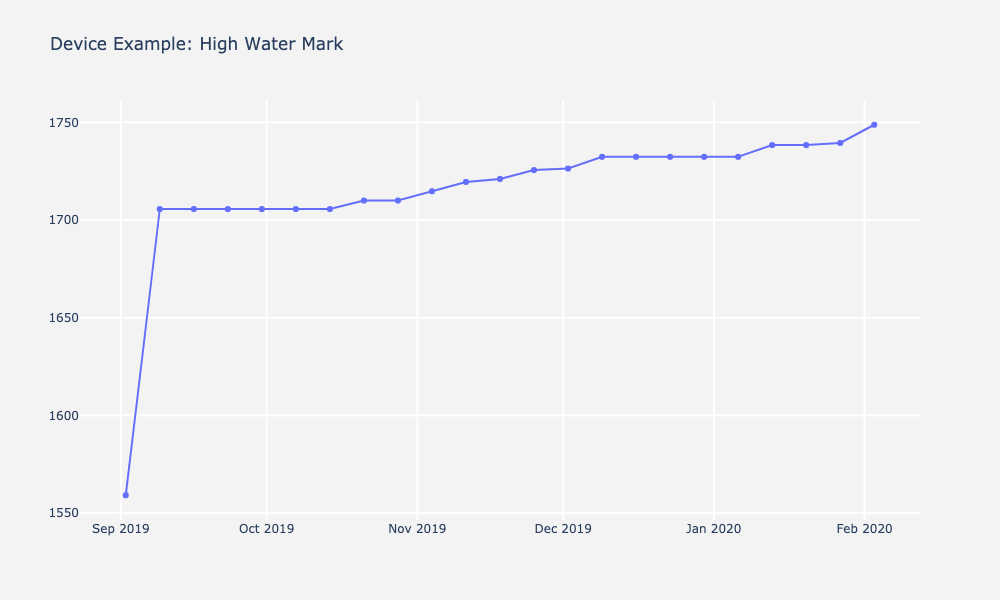
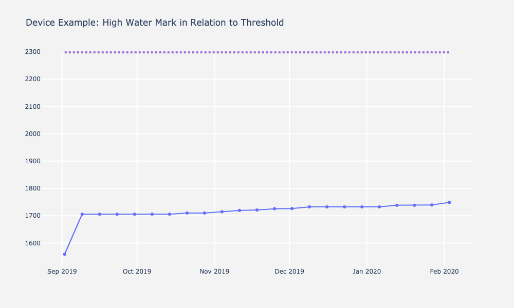
We then plotted data of all devices. Below is an example device highlighting the importance of visualization. Depending on how you look at the data can make immense difference in the interpretation of it. The graph on the right is plotted with respect to the resource limit, which makes the variability in bytes look much less extreme than it appears on the left. These graphs inform us the steepness of the rise of high water mark over time and became critical when interpreting forecasts and predictions with different models.
2) Formulated hypotheses about the data and test the hypotheses
We faced two big challenges when we looked at these data points on a graph.
Challenge #1: The first challenge we faced was related to the number of data points per device. We only had monthly snapshots of memory allocation over ~1.5 years. This means we had about 15 data points on average per device. For a successful time series analysis, you need least 2 to 3 years’ worth of data to predict 2 years out, which would mean we would need at the very least 24-36 data points per device. Because we didn’t have much data, we could not confidently or reliably trust seasonality and trend detection tests we ran. This issue can be resolved with more data, but at the time we were given the problem, we could not trust the statistics completely.
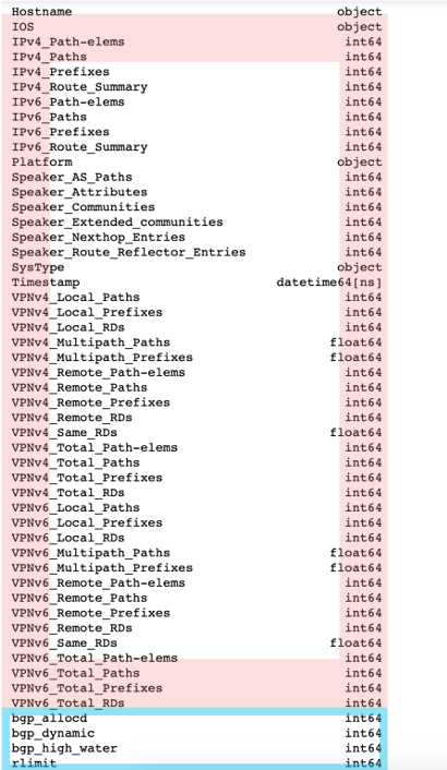
Challenge #2: The second challenge we faced was related to how we could use extra variables as leading indicators for a multivariate model. The red continuous variables below were all of the variables we could consider as leading indicators for high water mark. We had a wealth of choices and decisions to make, but we had to be extremely cautious about what we could do with these extra potential regressors.
Based on these sets challenges, we made 4 formal hypotheses about the data given.
Hypothesis 1: Given the current dataset, we cannot reliably detect trend or seasonality on a device.
We failed to reject the null hypothesis that there is no trend. Statistically, we found trending data in some devices – upward and downward. However, because of the number of data points, we felt there was not a strong enough signal to suggest there was a trend in the data. After removing trend, the data became statistically stationary. We detected no seasonality.
To make this conclusion, we plotted our data and ran the ADF and KPSS tests (mentioned in part 2 of the blog series) to inform our decisions. For example, let’s take a look at this particular device below. Visually, we see the data has some trend down, but it is not by many bytes. Additionally, we could see that for seasonality there is not much there. As mentioned before, we needed at least 2-3 solid years to detect seasonality or at least definitively say there is seasonality in the data. When we ran the ADF and KPSS tests, the results suggested that the data was non-stationary, but because there was so little data at the time, we believed it would not make a difference for our models if we made data stationary or non-stationary.

Hypothesis 2: There is no significant correlated lag between the PATH variables and BGP High Water
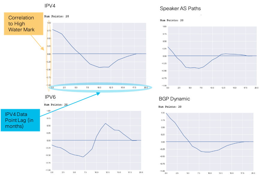
We found 3 features that were highly correlated with high water mark. They were IPV4, IPV6, and Speaker AS Paths. Because they were highly correlated, we thought these features could be used as leading indicators to high water mark. However, on closer inspection, that was not the case. For a variable to be a leading indicator, we needed the variable of interest to be highly correlated with high water mark at a lag point. For example, say the point at IPV4 rises by 1000 bytes in month 10, and high water mark will rise by some amount in Month 12. For IPV4 to be a leading indicator of high water mark, you would need to see this 2 month rise consistently across time.
Notice the plots below on the right. For the IPV4 variable, we lagged the data points by each month and then looked at the correlation coefficients to high water mark. Notice that you see a high correlation between the IPV4 points and the high water mark at the first data point, also called lag 0. The correlation coefficient is around 0.75. However, this correlation won’t tell us anything other than that when IPV4 paths rise, high water mark rises at the exact time and vice versa. If you look at the data points after the first one, you will see the correlation with high water mark go down and there is a slight dip before going back to no correlation at all. Because of this, we ruled IPV4 out as a leading indicator.
If you look at the relation between IPV6 and high water mark, at around 12 months lag, you see a correlation rise to about 0.6. IPV6 looks like an interesting variable at first sight, but with a little domain knowledge, you would understand that this is also not possible. Does it really seem possible for the example device below, that when IPV6 paths increase, high water mark increases a year later? If we had 2 years of data, and we saw that rise happen again we might think there is something there, but we did not have enough data to make that call. Now think about all of this for forecasting. We could not predict out a month, let alone 2 years, if the indicator we were basing your model on rose at the same time as the target variable. We therefore did not consider any variables for multivariate forecasting, but we wanted to leave little doubt about it. This leads to hypothesis 3.
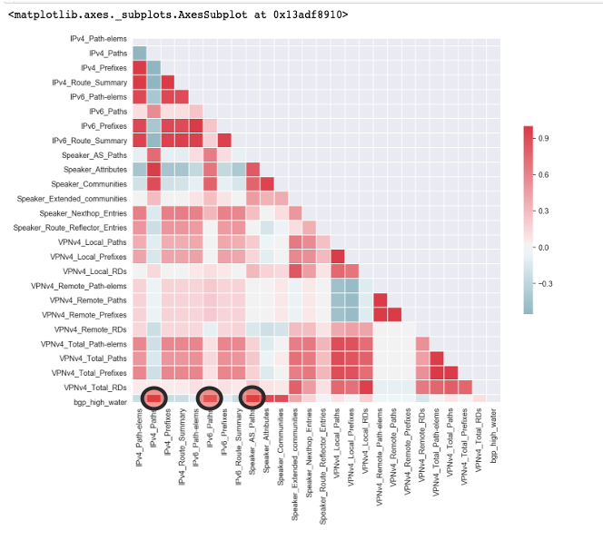
Hypothesis 3: High water mark is a function of the paths: IPV4, IPV6, and Speaker_AS, so cannot be used as explainers/regressors for High Water Mark
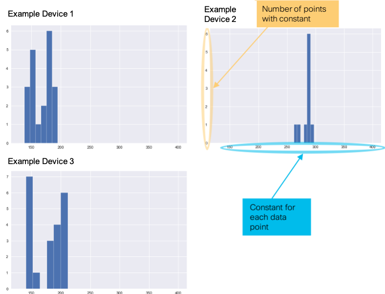
The high correlation of these variables also might be indicating that they are a direct function of high water mark, meaning that if we added these variables together times some constant, we would get the high water mark number in bytes. The histograms below highlight the variability in this constant for each device. If this variability is low, it is an indication that the variables of interest to the high water mark are probably direct functions of high water mark. We confirmed this with the following formula:
(IPV4+IPV6+Speaker)*X = high water mark or IPV4+IPV6+Speaker = High Water / X, where X is the constant of interest.
Notice the plots below for three example devices. We plotted X at each time point as a histogram. Notice there is very little variability in X. Each device’s constant is centered around a particular mean. We therefore concluded that with the leading indicators of interest, we could not use a multivariate model to predict high water mark. We would need a leading indicator that is not directly related to our target variable. A good example of a leading indicator in this scenario would be the count of how many IP Addresses were on the network at a single time.
Hypothesis 4: There will be no significant difference in MAE and MAPE from a Baseline ARIMA Model ARIMA (1, 1, 0) or ARIMA(1, 0, 0)
We then decided that we would try some different model types on our train-test split to see which model had the best model performance. We made our metric for best performance the lowest mean absolute error and mean absolute percentage error on the test set of a train-test split. We then evaluated the models further by forecasting 2 years out and evaluated the MAE and MAPE up to current data point at the time we received the data (6 months). The next sections highlight the outcomes of hypothesis 4.
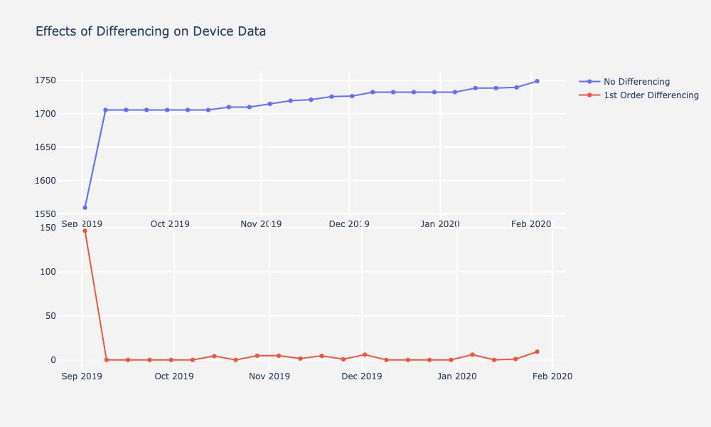
3) Made data stationary if needed
While we did not think we could reliably detect trend, we decided to run a model on differenced “stationary” datasets anyways. We also made models with the multivariate approach to see performance. We made a prior assumption that it would perform worse than a baseline ARIMA. Below is an example device plotted with its non-differenced and differenced data. All other device plots follow similar patterns.
4) Trained many separate model types and tested them against future values for validation
Below are the results of our initial analysis given the data on each device. We tried many different approaches, including ARIMA with a baseline model, Facebook’s Prophet model, ARIMAX, and an exponential smoothing model called local linear trend. Given the constraints of the data at the time, our best approach was a baseline ARIMA model. Results showed that across all devices, models using a baseline ARIMA with parameters p=1, d=0, and q=0 had the lowest MAE and MAPE. Given more data and time to detect the systematic components, we would likely have seen better results with more complex and smoother models. However, given the data we had so far, a simple ARIMA model performed really well!
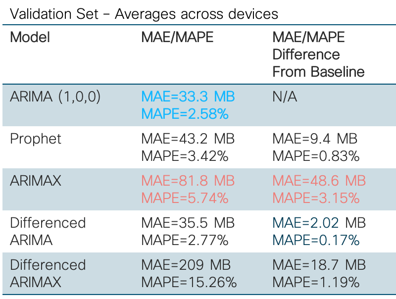
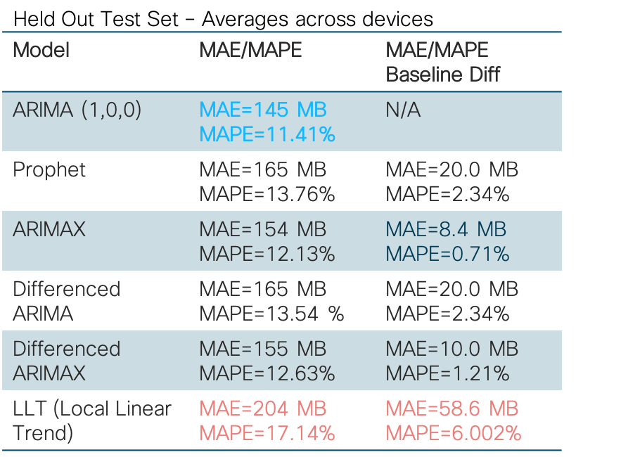
The baseline ARIMA was not without its flaws. Given that most of the data constituted random components, it was very difficult to predict out 2 years for as little data as we had. Thus, you will see forecasting patterns similar to the examples below. Training and testing yields relatively low and good mean absolute errors, whereas forecasts yield higher and worse mean absolute error over time.
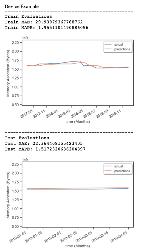
Below is an example of a sample prediction on a test set for 2-3 months out using ARIMA(1,0,0). Notice that both the training and testing Mean Absolute Error and Mean Absolute Percentage error are very low.
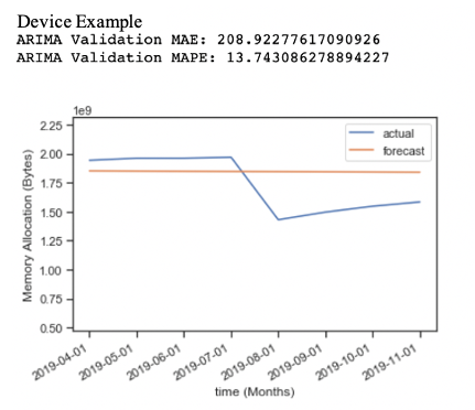
Next, is an example forecast done 6 months out without validation data using ARIMA(1,0,0). Notice the forecast is a straight line and visually you can see that the forecast error is much higher. It shows that a baseline ARIMA cannot adjust forecasts to the random change in the data. Because there was no reliable detected seasonality, cycle, or trend in the data per device, the model was trying to predict random components.
5) Conclusions and Recommendations
As a result of our initial analyses, we chose a baseline ARIMA model over other more complicated models. In our conclusion, we recommended to the client that they probably shouldn’t be forecasting out more than a couple of months. Instead, they can do rolling predictions out every 2 months as new data comes in and then scale to more complex models once trends or seasonality are spotted in the data.
For some good news on the project, we have recently gotten more data, and we have been able to integrate more complex models that utilize trend data. In our latest dataset for this use case, we have been able to spot trends and been able to make 2 year predictions with much more confidence using a model approach called local linear trend. We used this in our initial model approach but did not have much confidence in it given the data constraints at the time. Fortunately, time series models in general are very flexible given that the data input is simply time and a target variable. Model adaptations are therefore very fast and easy to implement once you understand the basics of time series analysis and have enough data to spot trends and seasonality.
XII. Designing Your Own Time Series Forecasts
Let’s end the blog with some rules you can follow to develop your own time series analysis. This will give you the confidence to start thinking about time series in a new way.
1) Always plot and decompose your data
Always plot and decompose your data. Even if you don’t think there are any trends or seasonality, it’s always good to look at your data!
2) Construct hypotheses about your data after looking at it.
Always construct hypotheses about your data after you look at it. You want to do this so that you can formalize what you think is going on in your datasets and test your assumptions about them. For example, suppose you were asked to predict out 2 years with only monthly snapshots of data. Maybe you don’t think you have enough data to detect trend or seasonality. It is possible that you will find no systematic patterns of trend and seasonality in your dataset. If you do not, know you will most likely be predicting only the random components of your dataset. This will help you make strong, testable conclusions later when presenting to stakeholders.
3) For forecasting, make sure your data are stationary. For some smoothing models you may not need to do this.
Remember the definition and rules of stationarity when using models like ARIMA!
4) If multiple variables are present in your data, try to determine the usefulness of using them in your multivariate time series model.
Can other continuous variables be used as leading indicators or signals to help you predict the next data point? If not, don’t use them! They likely won’t help your forecasts, and might actually make them worse.
5) Choose models that make sense for the data you are given, and don’t be afraid to experiment with model parameters.
The autoregressive and the moving average terms may sometimes cancel each other out under certain conditions. Refer to the post below to help you understand your data better and pick the appropriate lag parameters. This was also mentioned in part 2 of the blog series: understanding lags.
6) Compare model parameters and model types. You will likely find that simpler models are usually better.
Always try using simple models first as a baseline, like ARIMA(1,0,0) or ARIMA(1, 1, 0). Then you can add more complexity if your data has complex systematic components like trend and seasonality. You will likely get better prediction accuracy and lower forecast error as you get more data. Additionally, if you don’t need multivariate analysis, don’t use multivariate analysis. Only use it if you think it will improve your forecasts.
Resources and Tools
Below are the tools I used extensively during my research with this use case and when writing this blog. I encourage looking through these when doing your own work and are new to time series analysis.
Rob J Hyndman has an excellent course on Time Series forecasting applied to Business and Economics. Below are some links to his posts. He is considered by many as the father of time series analysis.
StatsModels: Python module for implementing any type of Time Series Based Model. As a data scientist, I am a big python user. I encourage you to check out the StatsModels library. This has many built-in time series functions like ARIMA, Local Level Trend, KPSS Tests, and many other useful tools for data scientists.
Plotly: When preparing this blog post and in my work, I use this python library extensively. It is very versatile and easy to use. Also the plots look nice and clean!
Facebook Prophet: R and Python, Open source time series forecasting that works very well with seasonal data and data with irregular time jumps. I have used this in my work as well and it is very easy to use if you are starting out with time series. It uses smoothing, but is not based in ARIMA methods, but another class of models .
I really hope you enjoyed the blog series! Do you have any experience using time series modeling in a real-world setting? Feel free to let me know in the comments.


Awesome, Bradley! Great job articulating the BGP use case using the ARIMA analysis.