As my colleague Damien McCoy wrote recently, Webex Teams is much more than just a rebranded Cisco Spark app. If you used the product for a while, you’ll be the first to agree. We’re revamping the user experience. Colors are changing. Layouts are different. Tools streamlined. And more features are coming. It’s all delivered by the enhanced Cisco Webex collaboration suite.
A lot of people love the changes. Others miss an element of the old user interface. (Example: There’s still passionate discussion about the change from People and Spaces to a single Spaces list.) I know a ton about the product and can tell you why a change is beneficial, but I’m not the expert behind the changes. It takes more than an expert. It takes a team of design experts who look at data, talks to users, and come together to make difficult decisions about the direction of the product’s user experience.
I sat down with Torkel Mellingen and Ingrid Kvaal of The Design Group within Cisco Collaboration to learn more.
Jeff: Let’s talk app UX design. It sounds simple, but I know it’s not. What goes into app UX design, especially when it comes to redesigning a product?
Torkel: Design is one of those things where, if it’s done well, it seems like it’s very easy. The reality is redesigning a product like this is more like solving a puzzle that has more pieces than space. Which of course is why it’s so fun and challenging! At Cisco solving the puzzle gets easier with more data.
We gather as much input as we can from multiple sources early in the process so we have a pretty broad and deep understanding of the problem. In the case of the Cisco Spark redesign to Cisco Webex Teams, we’re using first-hand insights from administrators and end users at long-standing customers across four continents. In addition, we continually analyze usage metrics to support anecdotes with empirical evidence.
Why are we redesigning the Webex Teams app user experience?
Torkel: We wanted to tie Webex Teams even closer to the rest of the Webex suite. The Webex Teams app is a pivotal element of our portfolio because it connects previously separate workloads into a single workflow. To enhance this value proposition, the redesigned experience makes Webex Teams an even better companion app for the Webex Board and our other devices. And new team meetings are now a front-and-center part of the experience.
The previous app had become very feature-rich, but the data showed that users weren’t always leveraging the new tools. With the redesign, we’ve streamlined feature placement (yep, just like a puzzle) and provide more detailed in-product guides. Now we can be more confident that lower usage levels aren’t happening because users can’t easily locate a feature.
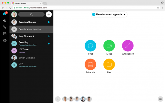
The Webex Teams interface recently changed the background and other graphical colors. Why the shift?
Ingrid: We had received a lot of feedback about the visual appearance of the app. We usually don’t see users being this actively engaged in the visual style of work tools. But with this case, the homogenous coloring and flatness of the interface were among the top user concerns. We also observed that new users struggled to grasp the structure of the app because it had little visual hierarchy or organization.
When we started testing the two-color split layout with a dark background on the left and a white activity area on the right, we saw that people were much quicker to orient themselves and accomplished their desired task.
Moving from People and Spaces lists to a single, combined list has been the “Yanny vs. Laurel” of Webex Teams. What drove this decision? Are there other similar decisions you can describe?
Ingrid: Yanny and Laurel, I love that parallel! It’s very true. There are crossroads in the world of UX where features can create polarizing results. Sometimes the right answer in a situation like this can be a user setting or preference, but that’s not something we can do for every case of dissonant feedback. The best case is to create the best default experience, and then add user controls where it provides the most value.
In the case of the people/spaces lists, the split experience was causing confusion because it wasn’t aligned across our desktop and mobile apps. We chose to standardize on the mobile version, which presents a single list because it was the simplest and worked on all screen sizes. Feedback from users who prefer the “split” list prefer it because it helps them prioritize 1:1 messages. However, the beauty of the single list is that we have more real estate to enhance the experience going forward. So I think both the Yannys and the Laurels will win in the end!
Another example is about using video. Our own strategic desire is to encourage more use of video, so we designed Webex Teams with a video-first experience. At the same time, people have overwhelmingly expressed a desire for choice. I’m happy about our decision to let users decide with an audio-only option that is in our near-term roadmap right now.
Some bigger changes coming soon are a new calendar interface and a more prominent activity menu. Can you talk about what’s in store?
Ingrid: Those are exciting changes. And they’re all part of our goal to streamline collaboration experiences.
I think the new calendar view is so much better for viewing your upcoming meetings. I find I am using my regular calendaring tool less now that I’m using the early version of the new UI. But the part I like the most about it is that it provides clearer connections between meetings and spaces. Perhaps you have an upcoming meeting but need more detail before it begins. Now you can just go to the calendar to start a messaging conversation with the invited people. This can help make the meeting more organized and focused once it starts.
The planned new activity menu in spaces also offers a usability improvement. The aim is to show all the available activities in a space as equal, including messaging. This way the interface is equally relevant for customers who want to focus on a subset of the app’s features.
How will additional updates roll out for users? How do you monitor receptiveness to updates? Would you ever revert to a previous UI element?
Torkel: We chose to split this redesign into multiple steps that will continue over the next couple months so the changes reach people gradually. While some people wish we could do it all at once, we’re taking this approach because it gives us time to adjust to feedback and safeguard the existing experience people are enjoying. Here’s how that works:
First, we roll all changes out to a sizable group of Cisco users, to weed out the obvious hiccups. Until it works internally, we don’t consider it fit to release externally – even to a small group.
Once the changes pass the bar internally, we share them with a few customers and gather as much direct feedback as possible. At the same time, our researchers pore over usage metrics and contact users for more details when necessary. At any point in this process, we may decide that we need to start over. And that’s not just theory: We have pulled features back because they didn’t match user expectations.
And sometimes we proceed after carefully considering feedback because
- We’re confident that the majority of users will have a positive experience
- We know that althoughthere may be some short-term user experience tradeoffs, the longer-term result will deliver a major improvement over the current UI
Once we’ve been through these stages, we release the new experience to everyone. It’s an amazing feeling having so many people benefit from these changes. And the goal over time, of course, is that everyone is happy with the product all of the time. That’s our vision for the future. That’s why we love what we do.
Since we still have more design updates in store between now and September 2018, I’ll be sure to check in again with these two. For now, enjoy Webex Teams and keep letting us know what you think!
If you’re not using it yet, learn more about how Webex Teams can help your business. Get Webex Teams and tell us how you’re using it to help your team collaborate.
 Torkel Mellingen is vice president of The Design Group in the Cisco Collaboration team. He is dedicated to making user experiences that people stop to appreciate, either through a product that delights by its presence or a user interface that simply empowers people.
 Ingrid Kvaal is a director in The Design Group at Cisco, responsible for shaping how users effectively interact with Cisco Collaboration products. She is data-obsessed, seeking statistical usage trends to put the design puzzle pieces together to optimize how users accomplish their intended goals.


How can you shut off the unneeded parts of the new webex interface, such as the blank video thumbnails on top or side?
They make the shared screen smaller and harder to read.
Also, how can you turn off the hovering control buttons? When someone tries to click near the bottom of the screen, say on a shared desktop's task bar, you end up clicking on "chat" or "end session" instead.
Thanks,
Rob
Hi,
I really like this Webex Teams!
Just a suggestion: It would be nice to have an option for saving a discussion on a text file. 😉
Thanks,
G.