
Did you know Cisco.com gets more than 355.5M visits a year? One out of every 10 visits is from a mobile device and mobile usage is growing. Much of the Cisco website is mobile-friendly, with the new Cisco.com Home page, Product pages, revised Support Home Page, and over 7,800 Model pages. Now we are turning our attention to 200K+standalone, single HTML content pages.
A new mobile-friendly (responsive) template is being applied to all content pages on Cisco.com.
- In June, the team converted more than 17,300 pages to a responsive format
- By the end of September, 50,000 standalone HTML pages will be mobile-friendly
- By early 2016, the remaining standalone HTML pages, Books and Chapters, and all localized documents will be converted as well
It’s more than just a smaller screen size
Not only does the new mobile-friendly format automatically adjust to fit any screen size, it also includes some new design features:
- Breadcrumbs across the top that replace navigation entries on the left and provide more space for the content
- Responsive content, images, tables, and designated areas for items like “Open a Case” and Share buttons
- Downloadable versions including pdf, mobi, and epub, when available
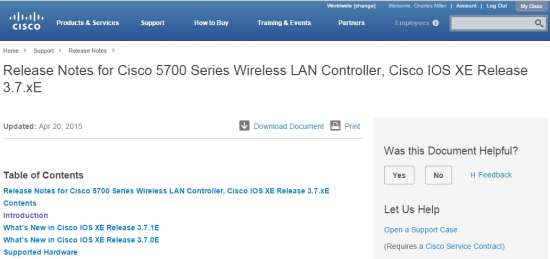
- Click through to see an example of a responsive page for product release notes:
Let us know how we are doing. Add a comment or click on the feedback link on any document, and we’ll get back with you.
– By Joann Hartman, Christopher Bey, and Vipul Ashta


Nice work!!
Wow…this is gr8 stuff.
Just doing quick math with statistics provided above:
1) “In June, the team converted more than 17,300 pages” (that makes 17300 pages per month).
2) “turning our attention to 200K+standalone, single HTML content pages” (around 200k+ pages – 17300 remaining pages)
The project might take more than 11 months to complete. Interesting stuff 😛
Great work!
Fantastic work. Thank you for sharing this, which shows the intent to make every Cisco.com web page “mobile friendly,” and which gives us a progress report showing leaps forward (yet far to go on the journey).
Mobile is so important. As a social media person, I’m always saying “mobile first!” because so many people (80%!) use social media on their mobile. Yay yay yay for this. 🙂 Great work all!
Thanks for sharing