
The Threat Grid team is always working on improvements to our leading malware analysis and threat intelligence platform. In the latter part of 2017 and into early 2018, the team has released a number of improvements to the User Interface (UI) and workflow, making sure that customers can get to the specific information they are looking for, as quickly as possible. In this blog, I’ll summarize the highlights here, and link to a more in-depth video about them.
As part of Cisco’s effort to simplify and unify the look and feel across Cisco’s Advanced Threat Solutions, the Threat Grid team has adopted a theme that, if you’re a customer of multiple products, will allow you to develop familiarity with a unified set of icons and design elements, ergonomics and workflow that will help you to quickly and intuitively navigate multiple platform interfaces with ease.
The Dashboard, the entry point of the UI, has received a major facelift that highlights a focus on your organization and its sample submissions.
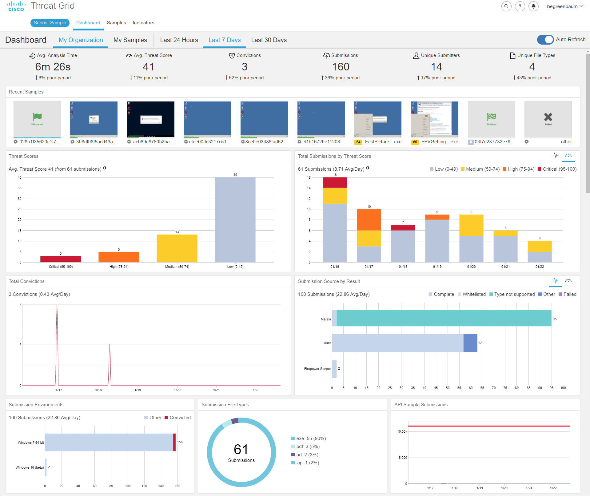
This new approach provides a set of easy to use controls to select the data that will be represented in the dashboard; users can choose between seeing only their submissions or all submissions from their organization, and of several convenient preset time periods.
In addition to a consistent look and feel and organizational details, there are a number of new panels that visually highlight statistics on your submissions that allow you to easily check in on the general status of your organization submissions and Threat Grid usage.
Another new feature is a panel with thumbnails of all recent dynamic analysis consoles. This is an incredibly quick way to triage your submissions. Hovering the mouse over any of them produces a popup with a larger, zoomed in view and allows you quickly determine which samples are close to finishing and which ones have completed.
The rest of the dashboard is composed of graphs and charts showing various aspects of your usage of the platform. These can be configured and like the data selection tools at the top, your settings will be automatically saved for the next time you log in, saving you time and allowing you to quickly see the latest stats. We’ve added several other capabilities here as well, including being able to see what the submission sources were for your samples (Meraki, portal user, Firepower devices, etc.) and the breakdown of submitted file types such as office documents, pdfs and executables.
One of the biggest features is the one behind the scenes – the performance boost of the UI. The dashboard is now much more responsive, having benefited from several foundational improvements that increase the speed at which query results are returned.
Last but certainly not least, the all new Sample Manager. The Sample Manager dashboard is a longer and more detailed version of the listing of recent samples you might be used to from the old dashboard, and is now a more powerful tool with its own page in the UI. Simply click on ‘Samples’ in the upper left navigation bar to get to it.
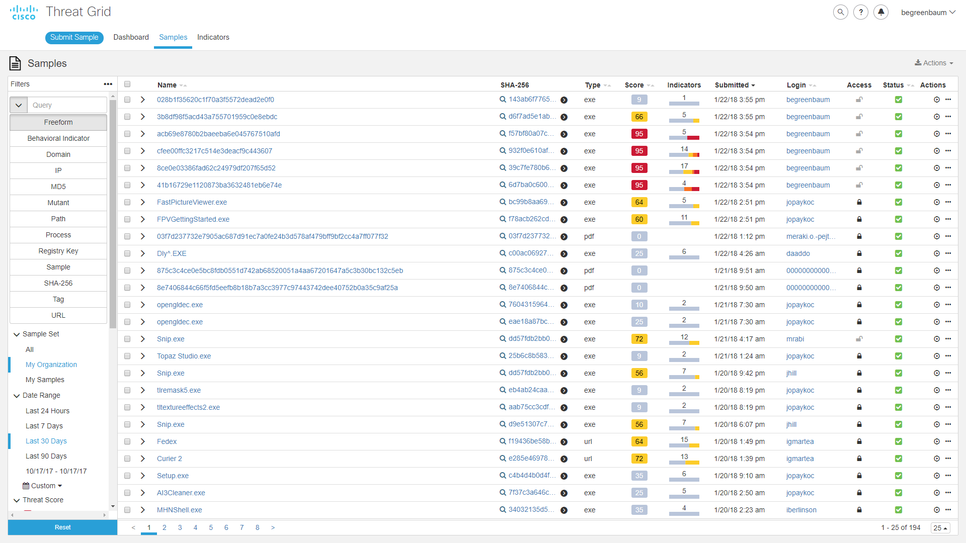
The left pane is a powerful set of filtering features, including the ability to perform many of the searches previously available via the advanced search feature. Additionally, you can filter by time period (including the option to set a custom date/time window), sample ownership, sample threat score, and sample source. Again, all these options will be saved for you the next time you log in. A new feature I’m particularly pleased to bring you is an option at the very top (in the filter panel), to display the API call that would be required to set the same filters in an automated search.
The right pane is the content and results area, in which you see all the samples that meet the criteria you set out in the left. Each sample’s row has its name, hash, score, a small icon that is densely packed with information about the behavior indicators that were triggered in the course of the analysis, and other useful information. Additionally, you can take several actions directly from this page, either on individual samples or on an entire set at once (via the checkboxes at the left of the rows). You can download any or all of the analysis data, view or save the runtime video, change the privacy options, and more.
With these changes, we hope that you find Threat Grid to be a more intuitive, faster and easier to use tool. You can quickly sift through large amounts of information for specific details, or easily view the set as a whole with insight into trends and breakouts. You and your staff can spend more time working, and less time getting to where the work is done.
In late 2017, as the first of these changes were rolled out, I made a short video going into more detail on the new features and layout – watch it here:
The Threat Grid team is constantly looking for ways to improve and releases new features every couple of weeks. If you have suggestions on how we can make Threat Grid better, share them in the comments below.


Great job folks! One request I have – and I know it is not an inconsequential request – but you folks recently added the ability for your software to click on .pdf's and social links sent through mail marketing platforms like Constant Contact. Unfortunately, your clicks to very security of the information delivered to your clients is wreaking havoc on the click through and display analytics! Can you please work behind the scenes with major mail houses to ensure you give them a way to strip out those "manufactured clicks" with an API or something? You are crushing our abilities as partners to market your great products! Thanks!
james ewing
Hi James! We certainly appreciate and value your feedback. As you may expect, the Threat Grid team is 100% focused on protecting Cisco customers from today’s advanced threats. That’s why Cisco’s Email Security Appliance products, when integrated with Threat Grid, offers the feature you mentioned: Clicking links on peoples’ behalf to identify and block sites that serve malicious content, before the end user gets them. The side-effect on email marketing analytics is unfortunate. Because of our customer commitments, it is unlikely that we will take action on this request.