
There’s a myth that home pages no longer matter. Here’s the thinking: Most companies and organizations find their digital traffic is now fragmented by their mobile apps, their social presence, and, of course, among hundreds of lower level “side door” pages that visitors find easily via search engines. Why bother with the home page when people are interacting digitally via all those other venues?
But in fact, home pages do still matter – they matter a lot! They matter because they’re still the front door and primary impression that Customers, potential new Customers, Partners, and others have of you digitally. And, as you might know from previous posts, 70-90% of interactions happen digitally before a potential new customer contacts your sales team or Partners. Not only that, but if the home page is getting even 10% of your visits (and in our case it’s a lot more), it’s a high-traffic destination that demands your ongoing attention.
With those things in mind, about six months ago we launched a newly redesigned Cisco.com home page. It was a pretty different design than its predecessor, and yet retained the elements we knew were working well. It’s a fitting time to look back at how we did it, savor the results, and see how the lessons apply to digital design projects in general.
A Quick Flyover
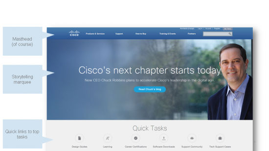
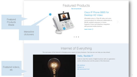
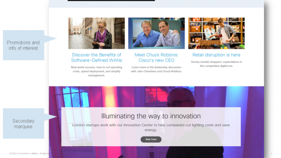
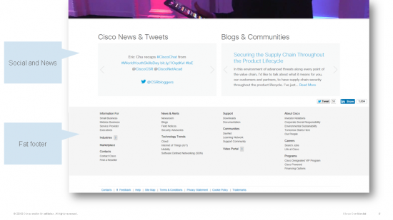
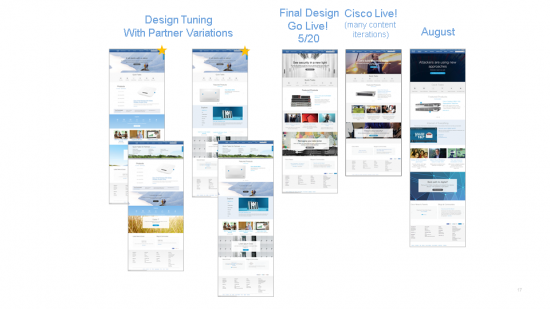
Just as a reminder, here were the elements of the home page this summer, slightly after launch. (These pictures will also give you some of the terminology we use to describe the elements of the page – bet you didn’t know home pages have their own secret language!)
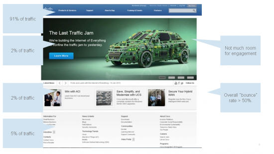
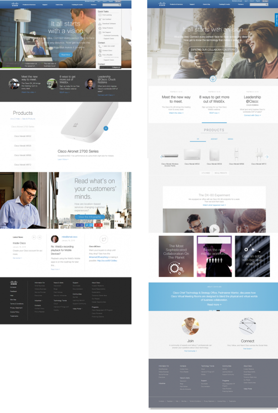
Oh, and you might remember the previous home page, which worked OK but definitely had some constraints:
Really, How Hard Could This Be?
There’s often an assumption outside of digital teams that projects like a new home page can be essentially a “paint by numbers” exercise. Those of us in design and customer experience teams in every company have certainly all heard the advice of “well, just look at the coolest stuff from everybody else and copy it!”
While it’s important to stay abreast of trends and know best practices, for a couple of reasons the “just copy something cool” approach doesn’t work very well. First, it isn’t aligned to your business objectives: The thing that works for another site – especially outside of your industry or domain – may not work at all for you. Secondly, you may be copying junk DNA: I know of many instances where an industry leader is experimenting with a design that turns out to have (secretly) failed miserably; while that company is busy scrambling with a working alternative, everyone else on the Internet has copied their failed idea and is busy implementing it with gusto.
So, to do a digital project like this right, you need at least three things:
- You need clear business objectives
- You need to understand your customers and users
- You need your major contributors involved
If you have these things and do them within the context of Lean / Agile development, your project will move quickly.
Key Objectives / The Digital Brief
At Cisco, we wrap up the first two business and user items above – and a lot more – into something we call the Digital Brief. This “brief” is in PowerPoint form, and articulates key information about digital projects. Items include:
- Business objectives and KPIs
- Key personas and audiences
- Key user objectives and top tasks
- Key issues / challenges
- Current metrics
- Current state usability
- Content audit, SEO (search) optimization, etc
- Competitive trends
- Global, social, mobile requirements
- Personalization and targeting requirements
- Project information such as stakeholders, team members, desired timelines, etc
In the case of the business objectives and KPIs, we outlined the information in a simple table that became a touchstone for the project:
| Business Objective | High-level Strategy | Metric* |
|---|---|---|
| 1. Boost engagement | Enable ongoing conversation about trends, products, technologies via social channels, news and personalized content | Increased click-through rate
Lower bounce rate (comparing pre vs. post-launch) |
| 2. Accelerate top tasks
|
Support and streamline customer and partner top tasks |
Higher Task Performance scores |
| 3. Support increased revenue
|
Focus on product, demand generation | Contribution to leads |
| 4. Showcase Cisco as an innovator
|
Dazzle the world with the Cisco story. Embody the new brand identity (visual, content, competitive). | Engagement, positive feedback |
| 5. Deliver a great experience across devices and regions | Focus on performance, mobile access, global experience | Coverage on mobile devices
High page performance |
Note that we have a * on the metrics targets, because at the very beginning they were directional rather than specific targets.
For current metrics, we looked closely at bounce rates, engagement rates, heatmaps of the most popular hot spots of the home page (navigation elements were 96+% in the old design, which isn’t necessarily a bad thing except it meant users weren’t engaging with the home page very much), and percentage of traffic from the home page over time. The engagement rates (to simplify, think of these as inverse of the bounce rate) were below 50% and that was a key number we wanted to boost.
To understand behavior on the home page, we incorporated key findings from earlier usability tests, customer interviews, analyst insights, and top site searches.
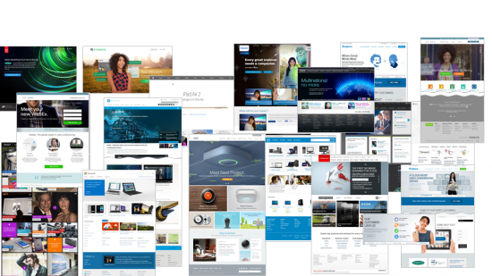
And yes, once we understood the objectives of our project, we did that “see what everyone else is doing” part of the project. Except that we called it a “best practices analysis” and was a pretty detailed examination of 60 different home pages and sites from a wide range of companies. We analyzed these not simply by what seemed “cool,” but more importantly through the lens of how their design elements might map to our similar business objectives.
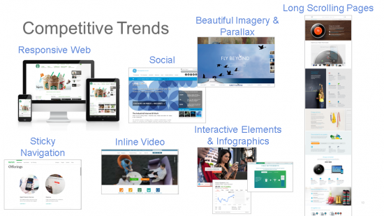
Beyond the key business objectives, we also had specific additional sub-objectives which are too lengthy to review but included details around global readiness, SEO/Search, brand, and more. And, we did look at design and stylistic trends:
Kicking Off the Project
It’s advisable to have a team kick-off meeting, where you create a shared vision project and begin solidifying how to achieve that vision. In this workshop for the home page, we:
- Reviewed the Digital Brief (both as homework and during the meeting)
- Refined objectives (customer, partner, & Cisco)
- Mapped objectives to strategy & metrics
- Identified potential constraints
- Began ideation by sketching (what the designs might look and behave like)
- Set the foundation for a formal commitment to do the project
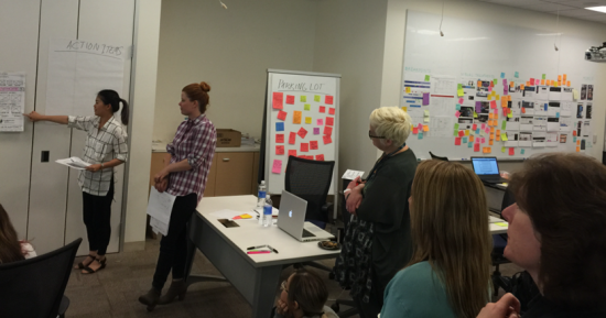
As you can see from this picture of one of our workshops, a lot of ideas get generated, and one of the advantages of doing Lean development is that even if not all the good ideas can get implemented immediately, you have a good pipeline of ideas to test for months after launch.
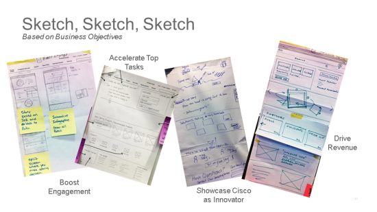
Sketching at the Workshop
One of the quickest and most effective approaches is to use sketching (yes, with markers and paper) to generate ideas and capture them into potential designs. If you’re not a designer, this may sound daunting, but it’s actually very easy to do; some of the best sketching ideas I’ve seen come from non-designers like engineers and back-line support teams.
In our Home Page workshop, we took the different objectives of the home page, and had small teams of 2-4 people sketch out their “ideal” home page design for meeting that one focused objective. The idea wasn’t to arrive at final designs here, but to generate ideas that could later be mined and combined.
Designs Drive The Project
Even though we hadn’t settled on absolute final designs, we were able to take digitized versions of the sketches and use them as props to drive technical conversations about what we needed. Here’s an example showing an early sketch we used to call out some technical requirements such as “mobile first responsive” design; the concept of flexible blades; of a top task blade; the concept of different experiences for Partners, Customers, and other audiences; the need for flexible layouts; etc.
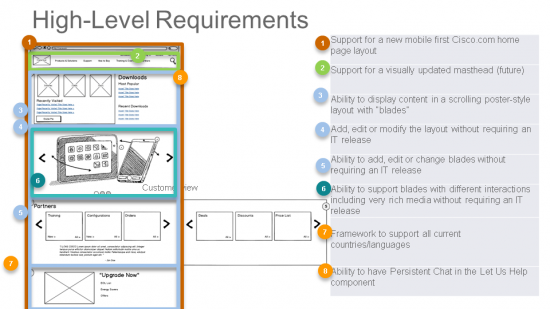
This wasn’t the final design by any means, but it gave us principles to start with quickly.
As we solidified the first designs, we were able to leverage the notion of blades to split development between agile teams. This gave us a lot of quick traction.
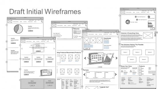
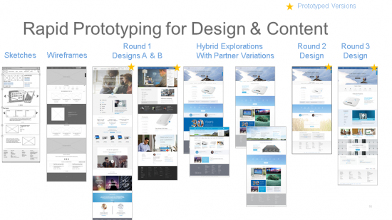
Wireframes, Prototyping and Iterative Usability Testing
There’s something of a disdain for wireframes these days, but we found it very useful to turn the sketch ideas into wireframes that we could use to guide conversations internally. These were also very helpful for our visual design team as starting off points.
Somewhat in parallel, we developed Bootstrap-based prototypes of two competing designs, which were used both in usability testing and also to help assist in conversations with the technical teams. (For complex reasons, the actual final code used on the live home page is different from what we used in the prototypes, but the prototypes were still immensely helpful.)
The usability tests helped us understand quickly which elements of the designs would work best. Not surprisingly, some elements from both designs shone brightly.
On the desktop designs, a task-oriented version (left) performed more strongly than an alternative “storytelling” design (right), but users did like the idea of featured products that they saw in the storytelling version (right).
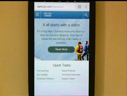
As with the “desktop” home page design, two competing responsive mobile versions were tested, and here even more strongly the design that led with tasks (left) won over the one that led with a story. Here’s one of the mobile task-oriented designs, focused on tasks:
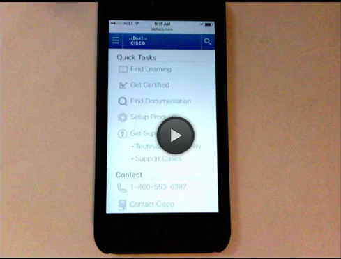
In a later rev, we learned that on phones, the tasks were just as obvious as links and didn’t require the space-eating icons, so we went with simple links in the final tests and that design was quite successful.
By the way, though all this testing sounds time-consuming, we used a variety of remote self-service and facilitated testing mechanisms I’ve mentioned previously in order to get insights back in as little as a day or two.
Content is King
Just looking at the new designs, you can imagine they required a totally fresh approach to content, which is a story all on its own for another time. Suffice it to say we had a ton of previous insight into the kinds of content and headlines that work (and don’t work) with our core audiences, and we built this not only into the design plans, but also standards for content. Content is a huge subject all its own, but some things we counter-intuitive things learned from ongoing tests of previous home pages were:
- The top spot on the page isn’t necessarily the most effective for click-thrus. This “hero” or “marquee” area is popular with marketing teams in most companies, and does give a strong brand impression and add panache to an experience. But, just because it’s big and pretty doesn’t mean people will interact with it the most; in some cases, “banner blindness” may incline users to look past it, in fact.
- Video is great, but not always a silver bullet. There’s a tendency to want to create videos for everything, and we found in our earlier experiments that the efficacy of the video depends (no surprise) on the relevance of the video content, as well as tightness of production and other factors.
- For our audiences, images of people using products perform a lot better than just people alone – and in particular, better than corporate stock photography.
- Focused content (single idea; clear connection to a solution, product, event; clear benefit) is best at leading users to their next step.
- Geo-targeting of content (example: German events or offers promoted on the English-language central home page, for users coming from Germany) can be highly effective (but also are a lot of work to manage).
A big change coincident with the launch of the new page was adoption of a “news room” model for content, with the idea that content could and should be “always on” with frequent refreshes. Complementary to this are live feeds from Cisco blogs, which contain previously hidden gems of content and update frequently. The design also showcases Cisco tweets and news in a bigger format than the previous narrow “ticker” style.
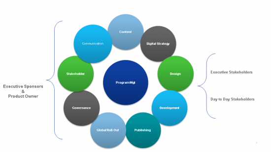
Stakeholder Involvement
One worry in a larger organization is that there can be literally hundreds of people trying to help you in design of something like a home page. We were on a fast timeline with laser focus, and we knew that having 100 cooks wouldn’t create the meal we wanted. And yet, we also wanted to make sure everyone knew this new design was coming, and that we had gathered some of the best ideas from across the company. So, we did dozens of interviews and demos with both executives and internal experts to both gather input and show the progress of the designs.
For each meeting, we started our overview of the project with the key objectives, which was an excellent anchoring mechanism. The objectives had been blessed by our Vice-President of Digital, and also a Digital strategy committee at Cisco, so they had weight. Having objectives defined will steer the conversation to outcomes and away from the perpetual advice people are wont to give of “just do something really cool.”
Because we started the conversations focused on outcomes, the interviews generated a number of great new ideas, and often from unexpected sources. And, it gave our many stakeholders confidence that we were following the right approach.
Additionally, the cliche of “it takes a village” really did apply to the home page, and there continue to be a number of contributing teams from content, design, and development.
Continuous Innovation: Agile, Lean and MVP
One final important thing I’ll mention is that it helped immeasurably that we were using Lean and Agile development, and had clear definitions of two things:
North Star — a definition of where we wanted to ultimate aspirational designs to be.
Minimum Viable Product (MVP) — the definition of what would be minimally acceptable to put live as a home page in order gather usage data, get feedback from users, and innovate on success.
The MVP allowed us to launch something relatively quickly, and add new features or adjustments every few weeks. If you’re a frequent visitor to Cisco.com, you may have noticed a number of evolutionary changes in features and placement of items on the page; many of the “stretch” ideas we imagined in those early sketching workshops have now come to life.
The Results
So after all of this focus, what were the results? (Note some refined descriptions in italics based on learnings as the project progressed)
| Business Objective | High-level Strategy | Result |
|---|---|---|
| 1. Boost engagement | Include popular interactive elements (tasks, products) and enable ongoing conversation about trends, products, technologies via social channels, news and personalized content | Engagement up 12% at launch and climbing
300% increase in blog, community referrals |
| 2. Accelerate top tasks
|
Support and streamline customer and partner top tasks via a top task bar per audience |
Heavily used at 5%+ of clicks |
| 3. Support increased revenue
|
Focus on product, demand generation | Initially lower but now higher after tuning location of “offers” |
| 4. Showcase Cisco as an innovator
|
Dazzle the world with the Cisco story. Embody the new brand identity (visual, content, competitive). | Yes! |
| 5. Deliver a great experience across devices and regions | Focus on performance, mobile access, global experience | Page is longer but perceived performance is comparable to previous.
Excellent mobile compatibility. |
Marty Gruhn from web analysts SiteIQ summed up right after our launch: “Cisco.com’s clean new design has mastered the technique of using images to generate the right emotional connections and make Cisco’s core messages stand out. The Quick Tasks banner is a stroke of brilliance and savvy use of real estate that other sites shouldn’t miss.”
Beyond Home Pages
The steps we followed for the Cisco.com home page apply to any important digital project. If you define your objectives, understand your users needs and journeys, and do iterative design and development via Lean UX and Agile, you’ll likely have a winning project.
Thanks to all the contributors to this project, including strategists, content mavens, designers, developers, and publishers – it was a pleasure to work on it together!


Looks great Martin! Congrats.
Don’t often leave comments, but wow! Thank you for outlining your process so clearly. Truly a valuable rendition of what it takes to build a website and how the process should be driven by specific business goals. Thank you.
Wow! I had no idea that designing/redesigning a home page required so much time and effort. I now have a much deeper appreciation for web page designers. Thanks for sharing, Martin.
This is a really useful article!