This post is about Dashify, the Cisco Observability Platform’s dashboarding framework. We are going to describe how AppDynamics, and partners, use Dashify to build custom product screens, and then we are going to dive into details of the framework itself. We will describe its specific features that make it the most powerful and flexible dashboard framework in the industry.
What are dashboards?
Dashboards are data-driven user interfaces that are designed to be viewed, edited, and even created by product users. Product screens themselves are also built with dashboards. For this reason, a complete dashboard framework provides leverage for both the end users looking to share dashboards with their teams, and the product-engineers of COP solutions like Cisco Cloud Observability.
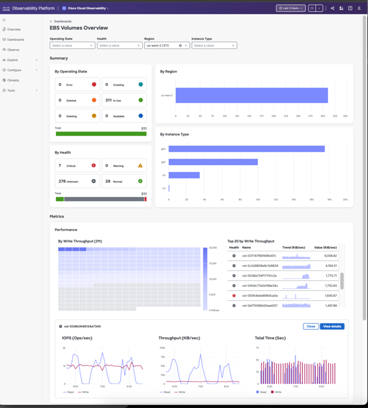
In the observability space most dashboards are focused on charts and tables for rendering time series data, for example “average response time” or “errors per minute”. The image below shows the COP EBS Volumes Overview Dashboard, which is used to understand the performance of Elastic Block Storage (EBS) on Amazon Web Services. The dashboard features interactive controls (dropdowns) that are used to further-refine the scenario from all EBS volumes to, for example unhealthy EBS volumes in US-WEST-1.
Several other dashboards are provided by our Cisco Cloud Observability app for monitoring other AWS systems. Here are just a few examples of the rapidly expanding use of Dashify dashboards across the Cisco Observability Platform.
- EFS Volumes
- Elastic Load Balancers
- S3 Buckets
- EC2 Instances
Why Dashboards
No observability product can “pre-imagine” every way that customers want to observe their systems. Dashboards allow end-users to create custom experiences, building on existing in-product dashboards, or creating them from scratch. I have seen large organizations with more than 10,000 dashboards across dozens of teams.
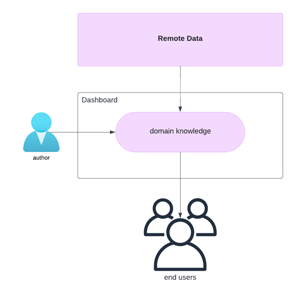
Dashboards are a cornerstone of observability, forming a bridge between a remote data source, and local display of data in the user’s browser. Dashboards are used to capture “scenarios” or “lenses” on a particular problem. They can serve a relatively fixed use case, or they can be ad-hoc creations for a troubleshooting “war room.” A dashboard performs many steps and queries to derive the data needed to address the observability scenario, and to render the data into visualizations. Dashboards can be authored once, and used by many different users, leveraging the know-how of the author to enlighten the audience. Dashboards play a critical role in low-level troubleshooting and in rolling up high-level business KPIs to executives.
The goal of dashboard frameworks has always been to provide a way for users, as opposed to ‘developers’, to build useful visualizations. Inherent to this “democratization” of visualizations is the notion that building a dashboard must somehow be easier than a pure JavaScript app development approach. Afterall, dashboards cater to users, not hardcore developers.
The problem with dashboard frameworks
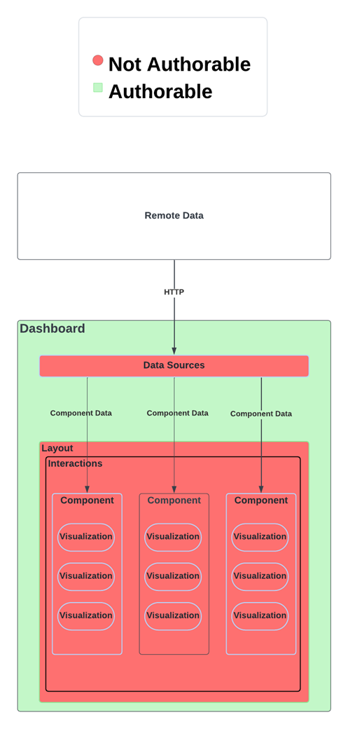
The diagram below illustrates how a traditional dashboard framework allows the author to configure and arrange components but does not allow the author to create new components or data sources. The dashboard author is stuck with whatever components, layouts, and data sources are made available. This is because the areas shown in red are developed in JavaScript and are provided by the framework. JavaScript is neither a secure, nor easy technology to learn, therefore it is rarely exposed directly to authors. Instead, dashboards expose a JSON or YAML based DSL. This typically leaves field teams, SEs, and power users in the position of waiting for the engineering team to release new components, and there is almost always a deep feature backlog.
I have personally seen this scenario play out many times. To take a real example, a team building dashboards for IT services wanted rows in a table to be colored according to a “heat map”. This required a feature request to be logged with engineering, and the core JavaScript-based Table component had to be changed to support heat maps. It became typical for the core JS components to become a mishmash of domain-driven spaghetti code. Eventually the code for Table itself was hard to find amidst the dozens of props and hidden behaviors like “heat maps”. Nobody was happy with the situation, but it was typical, and core component teams mostly spent their sprint cycles building domain behaviors and trying to understand the spaghetti. What if dashboard authors themselves on the power-user end of the spectrum could be empowered to create components themselves?
Enter Dashify
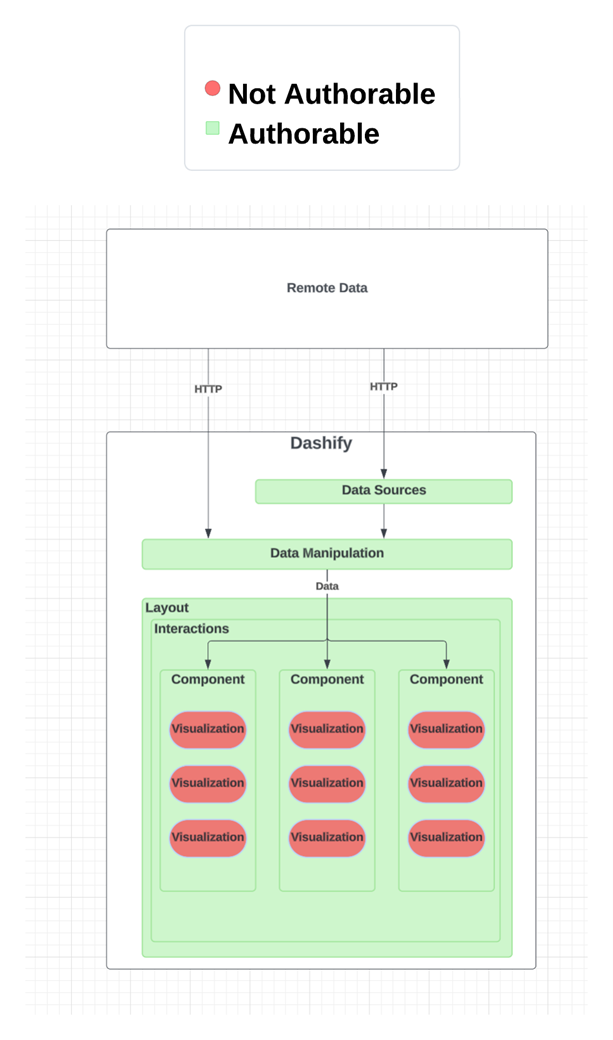
Dashify’s mission is to remove the barrier of “you can’t do that” and “we don’t have a component for that”. To accomplish this, Dashify rethinks some of the foundations of traditional dashboard frameworks. The diagram below shows that Dashify shifts the boundaries around what is “built in” and what is made completely accessible to the Author. This radical shift allows the core framework team to focus on “pure” visualizations, and empowers domain teams, who author dashboards, to build domain specific behaviors like “IT heat maps” without being blocked by the framework team.
To accomplish this breakthrough, Dashify had to solve the key challenge of how to simplify and expose reactive behavior and composition without cracking open the proverbial can of JavaScript worms. To do this, Dashify leveraged a new JSON/YAML meta-language, created at Cisco in the open source, for the purpose of declarative, reactive state management. This new meta-language is called “Stated,” and it is being used to drive dashboards, as well as many other JSON/YAML configurations within the Cisco Observability Platform. Let’s take a simple example to show how Stated enables a dashboard author to insert logic directly into a dashboard JSON/YAML.
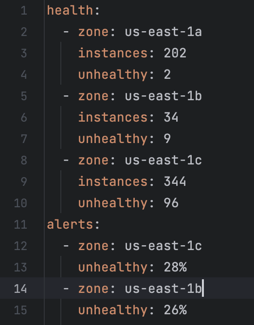
Suppose we receive data from a data source that provides “health” about AWS availability zones. Assume the health data is updated asynchronously. Now suppose we wish to bind the changing health data to a table of “alerts” according to some business rules:
- only show alerts if the percentage of unhealthy instances is greater than 10%
- show alerts in descending order based on percentage of unhealthy instances
- update the alerts every time the health data is updated (in other words declare a reactive dependency between alerts and health).
This snippet illustrates a desired state, that adheres to the rules.
But how can we build a dashboard that continuously adheres to the three rules? If the health data changes, how can we be sure the alerts will be updated? These questions get to the heart of what it means for a system to be Reactive. This Reactive scenario is at best difficult to accomplish in today’s popular dashboard frameworks.
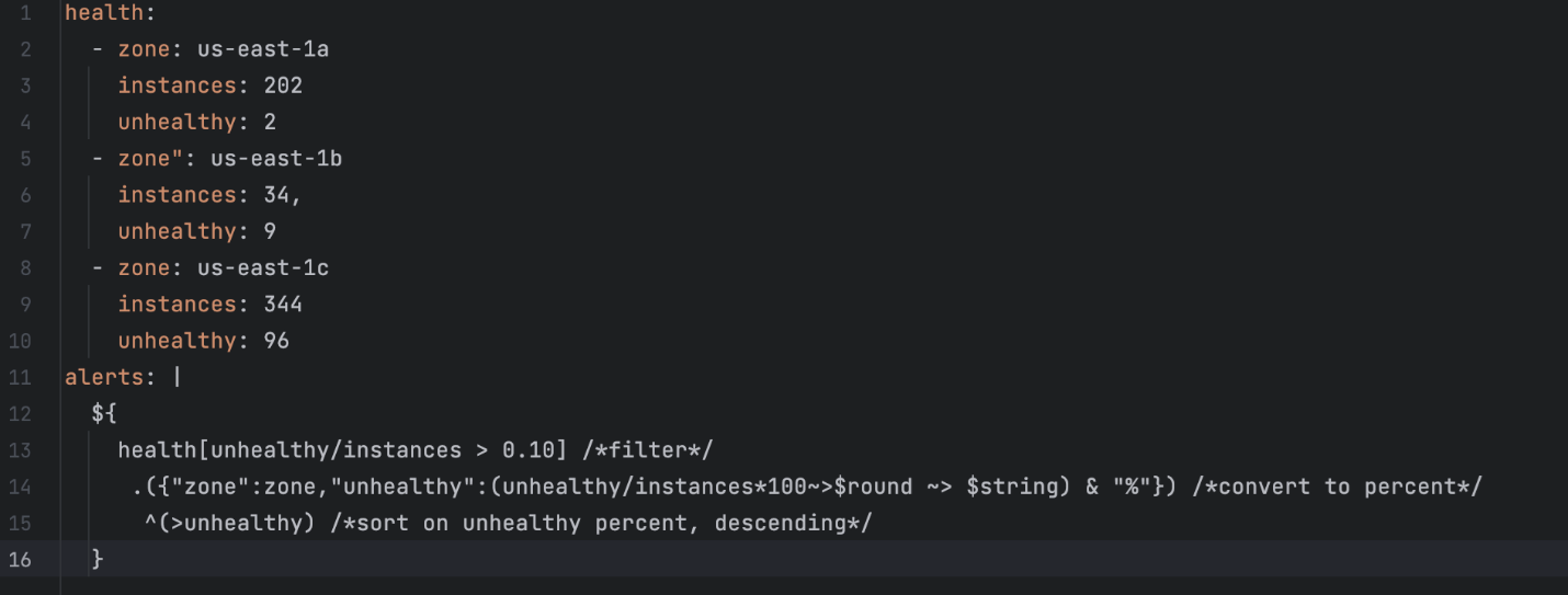
Notice we have framed this problem in terms of the data and relationships between different data items (health and alerts), without mentioning the user interface yet. In the diagram above, note the “data manipulation” layer. This layer allows us to create exactly these kinds of reactive (change driven) relationships between data, decoupling the data from the visual components.
Let’s look at how easy it is in Dashify to create a reactive data rule that captures our three requirements. Dashify allows us to replace *any* piece of a dashboard with a reactive rule, so we simply write a reactive rule that generates the alerts from the health. The Stated rule, beginning on line 12 is a JSONata expression. Feel free to try it yourself here.
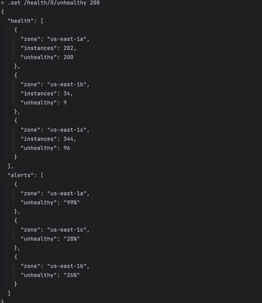
One of the most interesting things is that it appears you don’t have to “tell” Dashify what data your rule depends on. You just write your rule. This simplicity is enabled by Stated’s compiler, which analyzes all the rules in the template and produces a Reactive change graph. If you change anything that the ‘alerts’ rule is looking at, the ‘alerts’ rule will fire, and recompute the alerts. Let’s quickly prove this out using the stated REPL which lets us run and interact with Stated templates like Dashify dashboards. Let’s see what happens if we use Stated to change the first zone’s unhealthy count to 200. The screenshot below shows execution of the command “.set /health/0/unhealthy 200” in the Stated JSON/YAML REPL. Dissecting this command, it says “set the value at json pointer /health/0/unhealthy to value 200”. We see that the alerts are immediately recomputed, and that us-east-1a is now present in the alerts with 99% unhealthy.
By recasting much of dashboarding as a reactive data problem, and by providing a robust in-dashboard expression language, Dashify allows authors to do both traditional dashboard creation, advanced data bindings, and reusable component creation. Although quite trivial, this example clearly shows how Dashify differentiates its core technology from other frameworks that lack reactive, declarative, data bindings. In fact, Dashify is the first, and only framework to feature declarative, reactive, data bindings.
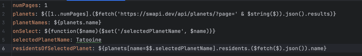
Let’s take another example, this time fetching data from a remote API. Let’s say we want to fetch data from the Star Wars REST api. Business requirements:
- Developer can set how many pages of planets to return
- Planet details are fetched from star wars api (https://swapi.dev)
- List of planet names is extracted from returned planet details
- User should be able to select a planet from the list of planets
- ‘residents’ URLs are extracted from planet info (that we got in step 2), and resident details are fetched for each URL
- Full names of inhabitants are extracted from resident details and presented as list
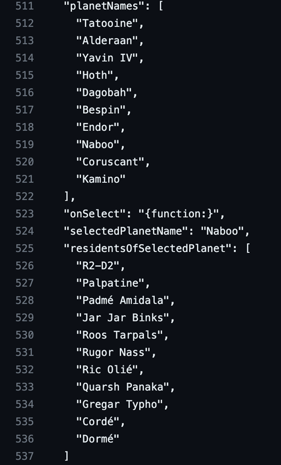
Again, we see that before we even consider the user interface, we can cast this problem as a data fetching and reactive binding problem. The dashboard snippet below shows how a value like “residents” is reactively bound to selectedPlanet and how map/reduce style set operators are applied to entire results of a REST query. Again, all the expressions are written in the grammar of JSONata.
To demonstrate how you can interact with and test such a snippet, checkout this github gist. It shows a REPL session where we:
- load the JSON file and observe the default output for Tatooine
- Display the reactive change-plan for planetName
- Set the planet name to “Coruscant”
- Call the onSelect() function with “Naboo” (this demonstrates that we can create functions accessible from JavaScript, for use as click handlers, but produces the same result as directly setting planetName)
From this concise example, we can see that dashboard authors can easily handle fetching data from remote APIs, and perform extractions and transformations, as well as establish click handlers. All these artifacts can be tested from the Stated REPL before we load them into a dashboard. This remarkable economy of code and ease of development cannot be achieved with any other dashboard framework.
If you are curious, these are the inhabitants of Naboo:
What’s next?
We have shown a lot of “data code” in this post. This is not meant to imply that building Dashify dashboards requires “coding”. Rather, it is to show that the foundational layer, which supports our Dashboard building GUIs is built on very solid foundation. Dashify recently made its debut in the CCO product with the introduction of AWS monitoring dashboards, and Data Security Posture Management screens. Dashify dashboards are now a core component of the Cisco Observability Platform and have been proven out over many complex use cases. In calendar Q2 2024, COP will introduce the dashboard editing experience which provides authors with built in visual drag-n-drop style editing of dashboards. Also in calendar Q2, COP introduces the ability to bundle dashify dashboards into COP solutions allowing third party developers to unleash their dashboarding skills. So, weather you skew to the “give me a gui” end of the spectrum or the “let me code” lifestyle, Dashify is designed to meet your needs.
Summing it up
Dashboards are a key, perhaps THE key technology in an observability platform. Existing dashboarding frameworks present unwelcome limits on what authors can do. Dashify is a new dashboarding framework born from many collective years of experience building both dashboard frameworks and their visual components. Dashify brings declarative, reactive state management into the hands of dashboard authors by incorporating the Stated meta-language into the JSON and YAML of dashboards. By rethinking the fundamentals of data management in the user interface, Dashify allows authors unprecedented freedom. Using Dashify, domain teams can ship complex components and behaviors without getting bogged down in the underlying JavaScript frameworks. Stay tuned for more posts where we dig into the exciting capabilities of Dashify: Custom Dashboard Editor, Widget Playground, and Scalable Vector Graphics.
Related resources
- Learn more about Cisco Observability Platform
- Find COP code examples on GitHub